Roo Money
Designing a budgeting app people would actually open every day, and the system that kept it consistent across iOS, Android and web.
Designing for a habit, not a session
Most budgeting tools are designed for a monthly sit-down. The design brief here was the opposite: something someone opens for a few seconds a day, every day, for years.
That constraint drove nearly every decision that followed. If an interaction took longer than making coffee, it was too slow. If a screen needed explaining, it was too complex. Everything got measured against whether it would still get used in week six.

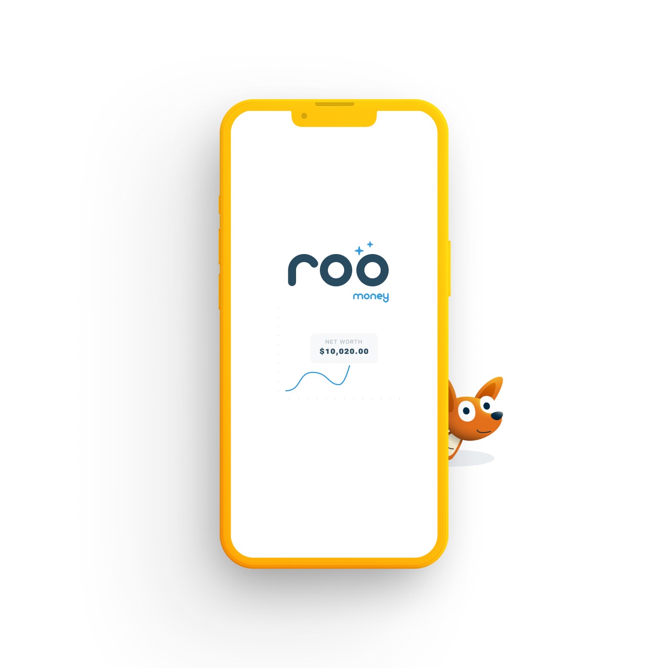
Reducing the home screen to one number
The hardest call was what to leave off the first screen. Bills, goals, pouch balances and upcoming transactions all compete for that space, and every one of them has a reasonable case.
The layout resolves all of it into a single figure, with the supporting detail one level down. That puts the burden of calculation on the product rather than the person, and it gives the screen an obvious focal point instead of a dashboard to parse.
- One primary figure, everything else secondary
- Supporting detail a tap away, never on the surface
- The same hierarchy on phone and web

Designing the two-second interaction
Sorting a transaction is the one thing people do every day, so it got the most attention. A swipe beat a tap menu because it works one-handed, needs no aiming, and can be repeated without the hand leaving the screen.
The details are where it succeeds or fails: the card has to show enough to decide without opening it, undo has to be reachable, and skipping has to be as easy as sorting so an uncertain transaction does not stall the queue.

Pouches as the mental model
Categories are an accounting idea. Pouches are a physical one, and people already understand that money set aside in a pouch is spoken for.
Choosing that metaphor settled a string of downstream questions: what an empty state means, what happens when a pouch runs out, how a custom one gets created, and what the icon set needed to communicate at small sizes.

A brand that carries a stressful subject
Money apps tend to pick one of two registers: stern and institutional, or so playful they feel unserious. The mascot was the answer to both, giving the product a warm voice without making light of someone’s finances.
Keeping that consistent meant defining where the character appears and where it stays out of the way. It carries onboarding, empty states and the marketing site. It does not turn up next to a number someone is worried about.

If the daily interaction takes longer than making coffee, the habit does not survive.The constraint everything was measured against